Posts

Rotation Week 5: Moodbords | Sample Making | Photoshoot

Image
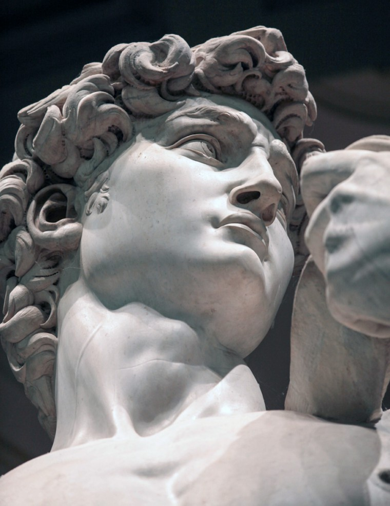
FASHION // Researching Our Theme // As required, I decided to do my research on Michelangelo. I didn't have him in mind initially but I was aware that I wanted to have some sort of sculptor to influence my work. I wanted to choose something very different but also at the same time it had to be a little similar to my interests. An obvious choice would be to research into architecture or into nature because they are some things I am familiar with having researched them a lot. I looked into sculpture and fond Michelangelo's work which is of course amazing. I decided to focus on arguably his most famous piece. David. I stuck in a range of images of David and wrote a little summary of the work, when it was commissioned etc etc. Moodboards // Another thing we were required to have was a moodboard. The moodboard would act as a narrative into what we were planning to achieve with our creation. It would also provide a creative direction for our designing, ac...

Rotation Week 4: Formal Elements | Tate Visit | Film

Image
PHOTOGRAPHY // FORMAL ELEMENTS //  I am very familiar with the formal elements of photography and the many ways they can be used to alter and add to a photograph. LIGHT: Distorting light was a surprisingly difficult one because that day had particularly moody weather and therefore there wasn't much natural light at all. I had to rely on artificial light as well as shiny surfaces to use for my photographs. Thankfully the NOW Gallery has a funky roof with many light strips on the underside which, when edited, can become very vivid and interesting.  SYMMETRY  TEXTURE & PATTERN RULE OF THIRDS TATE MODERN VISIT // Visiting the Tate for our contextual trip was certainly alright, it meant I didn't have to travel much and I'm a fan of some of the things Tate has to offer. I chose Daido Moriyama as the artist to study because I have seen some of his work before and I was always interested in studying him though I never g...

Rotation Week 3: Emotive Type | Campaigns | Software Induction

Image
EMOTIVE TYPE // For our first task of the graphics rotation we were required to change a typeface to reflect a mood. There was a list of emotions on the board that we had to interpret and come up with a visual representation using the typeface.  This emotion was frustration. I hope the scrumpled paper look was enough to say frustration  This was Joy. I went off of the phrase 'Bubbling with Joy'. To this very moment i'm not too sure whether that is a legitimate phrase but oh well. It felt right and therefore the letter 'A' is bubbling with joy Shy Surprise Confidence Nervous Chaos Anger They were all different shapes and sizes which was pretty cool. I also managed to use a different materials for each of them so there was a uniqueness to them.  CAMPAIGNS // Our next task was to create a campaign about a topic or issue we were passionate about. I began by researching important quotes from over ...